top of page


My role:
User Research
UI/UX Design
Apps:
Sketch
InVision
Miro
Marvel POP
Illustrator
Photoshop
The recipe app experience that makes cooking more frugal, fast and fun
Project context:
Capstone
4 months, 2020
Skills:
Low/High-Fi Designs
Wireframes
Prototyping
User Interviews
Style Guide
Usability Testing
CONTENTS
For more details on any part of this case study please go here
Americans are in a food rut. Short on time, patience, and meal ideas, we end up throwing away hundreds of dollars a year in unused food.
GOAL: Reduce food waste through the use of a
search-by-ingredients recipe finder
Anchor 1
THE STRATEGY
Study the grocery shopping habits, meal making and food waste of everyday home chefs.
Anchor 2
Anchor 3
GOAL: To learn how people plan & manage everyday meal prep

AFFINITY MAPS
From those interviews I was able to identify
the key pain points and wish lists:

PAIN POINTS
• Time is an issue
• Wasted Food
• Food Ruts

WISH LISTS
• FLEXIBILITY OF SERVINGS
• EASY TO FOLLOW RECIPES
• HEALTHIER MEAL CHOICES
EMPATHY MAPS
I was able to create maps for a deeper understanding of who two typical home chefs are:

USER 1: The inexperienced cook

USER 2: The confident home chef
Anchor 4
PERSONAS
Meet Kim and Sue, the two home chef personas
I identified through my data gathering.

Kim...
-
is not a confident cook
-
thinks recipe videos are “too long”
-
wants single serving recipes
-
can’t afford to eat out/hates leftovers
Sue...
-
is a busy working mom
-
would like her family to eat healthier
-
wants to save money
-
her kids can be “picky eaters”


What Kim and Sue have in common
- They want to save money
-
Think cooking is a chore
-
They hate wasting food
!
This led me to 3 questions that I took to the ideation process:
How could I make a recipe app more flexible?
How could a recipe app save money?
How can we make everyday meal making more fun?
Anchor 5
What does a flexible, frugal and fun experience look like?

How could I make a recipe
app more flexible?
Control is power.
Give users the power
to adjust servings,
ingredients, and time.

Wasted food is wasted money.
Give users the ability to
use up excess food.
How could a recipe app
save money?
How can we make meal making more fun?

Games are fun.
Give users the experience they are playing a game.
These answers meant that users like Kim and Sue would always know:
What’s for dinner? breakfast? lunch?
the name for this new recipe app was born!
Anchor 6
What worked, what didn’t work and why.
.png)
KEY USER FLOWS
What didn’t work:
ask users to sign up during onboarding
Why?
too many hoops to jump through
What did work:
let the user dive right into the app
without the hassle of signing up
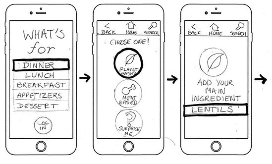
RED ROUTES
What didn’t work:
prompt the user to choose between
plant based or meat based meals
Why?
forcing the user to make a choice
limits recipe results, slows down ux
What did work:
move the meat or plant based choice
to the users preferences screen
%20(1).png)
WIREFRAMES
Using this feedback, I was able to create the wireframes for two user red routes.
-
a first time user looking for a recipe
-
a return user looking for a saved recipe
Keep it simple and fun
The simplicity of these early wireframes inspired the aesthetic of the app and spoke to the spirit of the project:
Anchor 7
THIS is what a flexible, frugal and fun experience looks like.

What's for Dinner? should:
-Be as familiar as walking into your favorite diner.
-Have energizing colors that stimulate your appetite.
-Should feel like picking up your favorite mobile app game.
HI-FI TESTING
I used a remote, moderated and unmoderated
usability test with 5 participants doing 2 tasks.
early hi-fi of onboarding, recipes results and selected recipe screens


-
The first task involved having the participant needed to find a recipe using 2 ingredients, take 30 minutes
to prepare and make it for 4 servings.
-
The second task involved having the participant act as a return user who needs to find a saved recipe and change the number of servings.
ISSUE #1
The spinning wheel moves too quickly and is hard to read.
Applied design change:
I slowed down the animation speed of the spinning wheel and enlarged the text.


ISSUE #2
There’s no clear way for a return user to log in and/or find a saved recipe from the onboarding screen.
Applied design changes:
• Created a log-in option.
• Replaced the “Help” icon on the tool bar
with the familiar “saved” heart icon.

final onboarding screen
FEEDBACK & APPLIED RESPONSE
final recipe result screen
ISSUE #3
Ingredients and instructions weren't immediately accessible on selected recipe screen.
Applied design change:
A complete redesign from a vertical split screen to an easier to navigate horizontal layout.
I created ingredient and instructions “recipe cards” that are found at a glance, with subtle arrow icons that instruct the user to expand on touch.


Anchor 8

People LOVED the idea of finding recipes by inputting ingredients already on hand in their kitchen.

Sometimes too much choice is
a bad thing.
Most recipe apps offer a sea of options... which I discovered often fatigued the user.

While all users were happy with
the game “look” of the app, not everyone was excited about
the gamification aspects.
NEXT STEPS

Explore incentives for users to utilize the gamification aspects of the app, such as gaining levels/prizes for completed recipes

Test out the feasibility of offering in-app experiences, such as cooking lessons and videos.

Research ways that could monetize the app such as subscriptions, advertisements and in app purchases
Final animated prototype
Anchor 9


For a more detailed case study please go here
bottom of page


_edited.jpg)

